
We’ve all come across websites that have kept us highly engaged, even though we might be able to fully understand why.
These sites sometimes seem like the unicorns of the Internet. Even if it’s not exactly what we’re looking for, we’ll still stay a while and explore.
It’s hard to narrow down what it is about these websites that inspire the user to want to know more. For instance, the seven on this list vary greatly in niche and UX design. But, we’ll take a deeper look at which elements grab the user and take them for a memorable journey down the proverbial rabbit hole (without the Red Queen, of course).
4 Rivers Smokehouse
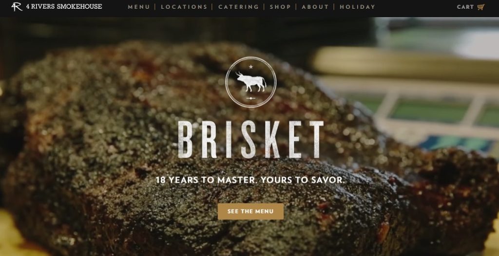
Most restaurant websites are okay, but they’re kind of bland. When was the last time any of us went to a restaurant’s website and started drooling? This is what 4 Rivers Smokehouse does to the user.
Now that we’ve all taken a moment to enjoy the video of that mouthwatering brisket, let’s see why this design works. Instead of focusing on text or stationary images, visitors are treated to a real live look into the food they’ll be treated to. Who wouldn’t want to click the See The Menu button to see all the yummy goodness this restaurant has to offer?
Telerik

Let’s jump to a mobile development site for a moment. Telerik may look like a lot of other tech type sites, but it does one thing different. There are actually bold buttons that inspire a user to click to learn more.
A complex design isn’t necessary here. By utilizing whitespace, visitors’ eyes are drawn to the large call to action buttons under each service. Another thing we love is how the services are listed well before the accolades. No need to scroll through a full landing page just to check out the services the visitor is most interested in.
OrangeSprocket
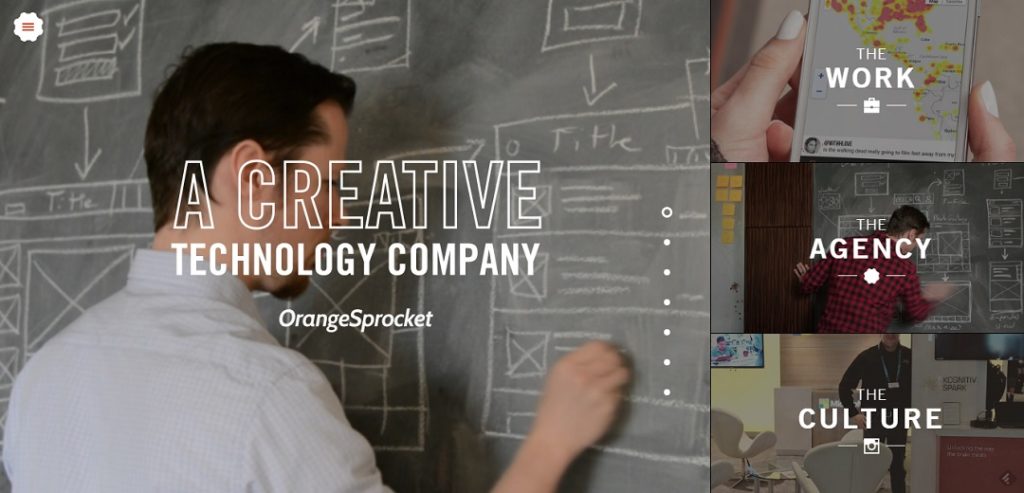
Forget the boring side scrolling carousel design that thousands of other websites use. Take a look at OrangeSprocket and it’s like suddenly having your world turned upside down. Seriously – their slider is vertical! Not only does it instantly grab a visitor’s attention, but it makes them curious to see what’s next.
A simple UX design change and a visitor wants to know more. Four panels is all that’s needed to engage visitors and make them want to explore.
Feed
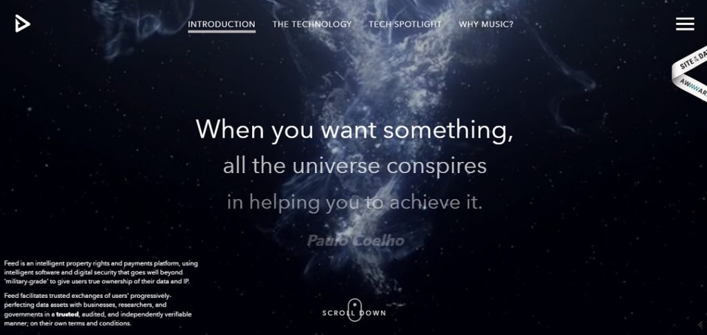
Beauty, function and true creativity merge perfectly with Feed. We’re not sure how to describe the site. It’s stunning from the moment a visitor arrives and the simple instructions of “Scroll Down” instantly makes a person curious. Try it and you’ll see what we mean.
In fact, the beginning section kind of reminds you of a Star Wars intro as the words scroll away into space. It’s a true user experience that’s engaging and impressive.
Inside Abbey Road
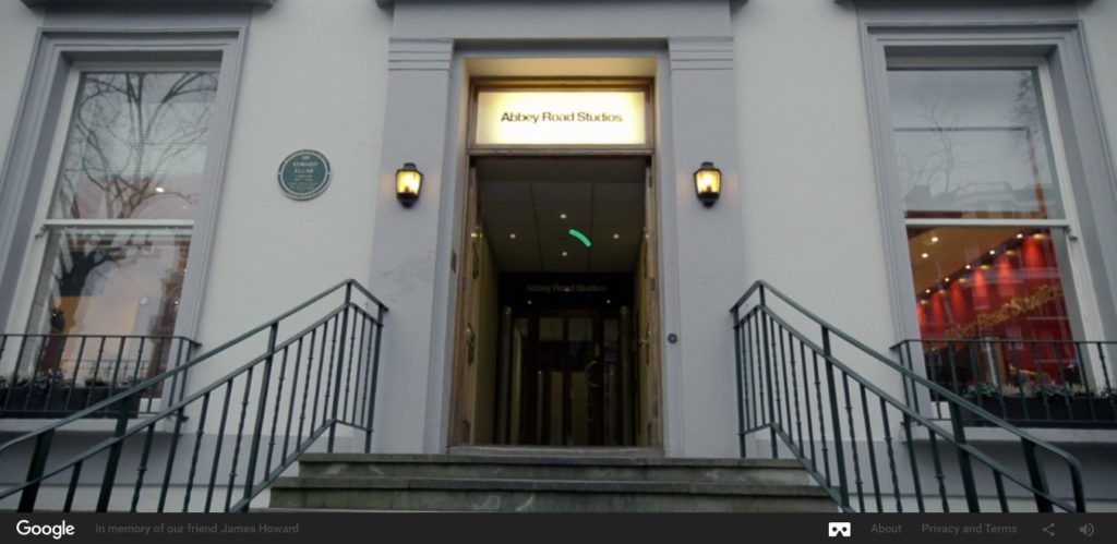
Ever wanted to walk where The Beatles walked? No, Inside Abbey Road can’t quite do that, but it does take visitors inside the historic recording studio. It’s the closest someone can get without an expensive plane ticket.
The highly engaging and interactive site keeps visitors wanting to know more. What’s around the next corner? What happens if I click here? It kind of makes you feel like you’re truly there, especially if you’re viewing the site on a large screen. Definitely grab some headphones for this site though.
Airbnb
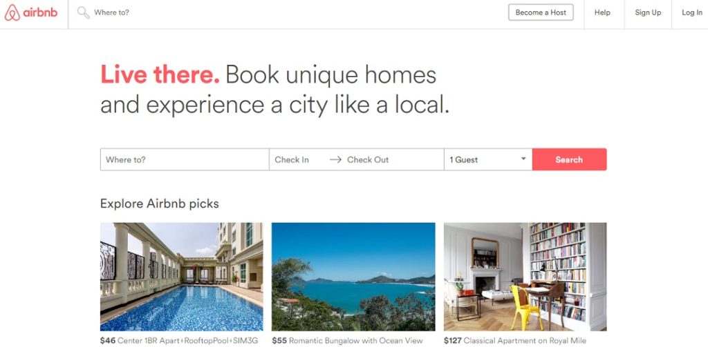
Airbnb is well known for the unique travel concept of staying a someone else’s home. Their site also stands out. The attention to UX design is easy to see and that’s what inspires users to want to know more.
For those ready to book, the first thing they see is the search area. For those who aren’t sure, there’s a section on popular locations asking the user to explore the world. That’s the kind of call to action that gets users to explore a website. Everything a visitor needs is right on the homepage without any clutter.
Be Inspired
It’s amazing the difference that a little creativity and attention to detail make. We look at these sites and it’s easy to tell why users want to stay and explore. Let these sites inspire your own creativity and see what type of experience you can create for users too.
Images:Bench Accounting, Homepage images from their respective websites