“If I only add this one more thing, or maybe just a few more touches here and there.” It’s a phrase we often mutter to ourselves as UX designers.
We want the design to be perfect, not just for the user, but for our own pride. There’s nothing wrong with that at all.
The problem comes when we over do it. Suddenly, that perfect design degrades into chaos and all our hard work goes right out the window. As hard as it might be sometimes, the key to great UX design is to always keep it simple.
Simple Is More Beautiful

Okay, let’s think about beauty for a moment. It’s in the eye of the beholder, but we all agree to a point. For instance, a Disney princess is usually referred to as beautiful or pretty. She always has a gorgeous gown that’s not over done, simple makeup and a cute hairstyle.
Now, think about clowns. They’re funny, but would you call them beautiful? No. All the contrasting, loud colors and way over the top makeup isn’t exactly pretty, but that’s the whole point. The simpler princess is beautiful, but the over done clown isn’t.
The same holds true with UX design. This analysis of prototypical design (it’s not nearly as boring as it sounds, we promise) proves that users have certain expectations of beauty. When users judge beauty within seconds, a simple design seems instantly more beautiful and appealing.
Complicated Design Distracts
Consider websites for a moment. A complicated design with numerous images, frames and other various elements might offer visitors all the information they could possibly want, but they can’t understand it. Why? The design is too distracting.
We want to give users everything they want at once, but when it’s too complicated, it’s distracting. Basically, we’re shooting our own designs in the foot. Simpler leads to better usability and in terms of web design, higher conversion rates.
UX Design Should Make Life Easier
At its core, UX design has one purpose – making a user’s life easier. For instance, upgrading football stadiums helps improve how easily fans, players and press navigate. It improves their experience. When designers keep it simple, at least on the surface, users have a better experience and that is what separates great design from poor design.
Complex Doesn’t Mean Extra Design
It’s important that we remember that simple doesn’t mean basic or minimalistic. The most complex design could still be considered simple as long as it makes a process as easy and efficient as possible for the user. Simple means doing just as much as is necessary to get the job done in the best possible way for the end user. So, with this logic, complex can be simple. Just remember that we shouldn’t add in extra design just for the sake of a fluffier design.
Excess Never Helps Anyone

We all love the extra food, especially the candies and desserts, during the holidays. It’s probably the reason most of us make New Year’s resolutions to lose weight after we realize we’ve gained an extra 10 lbs in just a few months.
The same holds true with UX design. We have to keep it simple because excess never really helps anyone. For instance, think about forms. A form with extra optional fields that’s surrounded with other images and text is just confusing. A simple form on a white background that only asks for the essentials is far more effective.
Users Should Perceive Simplicity

We loved this Quora question and the responses from UX designers. It’s well worth the read if you have a few minutes. To sum things up, it doesn’t matter what the design itself is as long as the user perceives simplicity. The example used throughout several answers talks about an airline pilot. The controls seem overly complex to someone who isn’t a pilot, but to the pilot, the seeminly over done design makes their life simpler by having everything they need, laid out perfectly for their needs.
Simple doesn’t the bare basics. Think about what the user needs. Design in a way that’s simple for them. That’s what they want. A design that’s simple to understand and use.
Put Users First And KISS
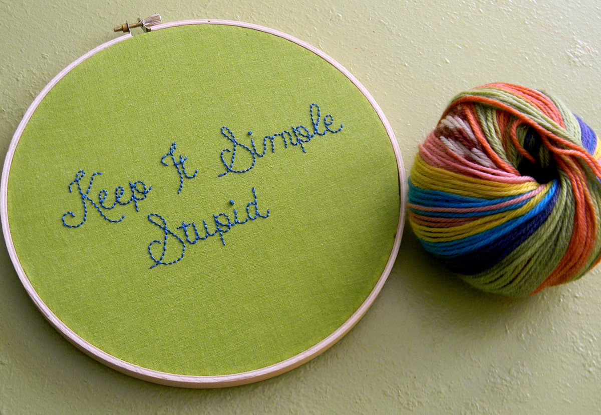
Before your next design project, keep two very important lessons in mind. First, always put the user first. After all, they’re the ones using the design. Second, KISS – keep it simple stupid. It’s a motto we could all use a little more of in our lives and when we do, our users may just want to “kiss” us in return.
Images: Hey Paul Studios, Noel Pennington, Pete Berkinshaw, Kai Hendry